Andrew Heiss has an interesting recent post where he uses ggplot2 to plot a nicely annotated supply-demand diagram. In this post we will take a somewhat different approach to solve the same problem, with the added feature of filling in the areas representing consumer and producer surpluses.
We start by defining supply and demand functions.
library(tidyverse)

demand <- function(q) (q - 10)^2
supply <- function(q) q^2 + 2*q + 8
We plot these over a specified domain using stat_function.
x <- 0:5

chart <- ggplot() +
  stat_function(aes(x, color = "Demand"), fun = demand) +
  stat_function(aes(x, color = "Supply"), fun = supply)
chart
We now need to find the point of intersection, or, in economic terms, the
equilibrium price and quantity. We use the uniroot function for this and pass
it an anonymous function that calculates the difference between the supply and
demand. uniroot then finds where this difference is zero. This gives us the
equilibrium quantity \(q^*\). Passing this quantity to the supply function then
gives us the equilibrium price \(p^*\).
# Equilibrium quantity
q <- uniroot(function(x) demand(x) - supply(x), range(x))$root

# Equilibrium price
p <- supply(q)
We can now annotate the chart with the equilibrium point.
chart <- chart + annotate("point", x = q, y = p, color = "grey30")
chart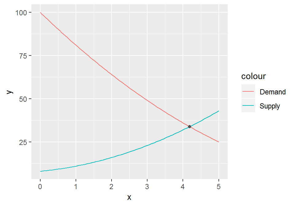
Next we add some dashed segments from the equilibrium point to the axes.
chart <- chart +
  annotate("segment", x = q, xend = q, y = 0, yend = p,
           linetype = "dashed", color = "grey30") +
  annotate("segment", x = 0, xend = q, y = p, yend = p,
           linetype = "dashed", color = "grey30")
chart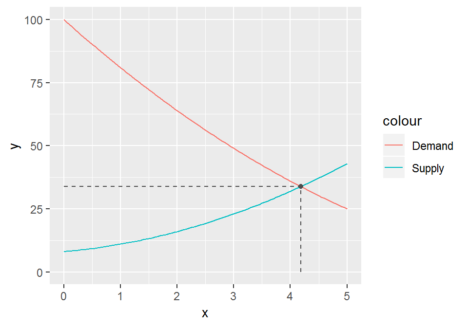
Finally, we want to color the area between the demand curve and the dashed line
as consumer surplus, and the area below the dashed line but above the supply
curve as producer surplus. For this we need to pre-calculate a dummy series from
0 to the equilibrium point, which we pass to the geom_ribbon function.
z <- seq(0, q, 0.01)

chart <- chart +
  geom_ribbon(aes(x = z, ymin = supply(z), ymax = p,
                  fill = "Producer surplus"), alpha = 0.25) +
  geom_ribbon(aes(x = z, ymin = p, ymax = demand(z),
                  fill = "Consumer surplus"), alpha = 0.25)
chart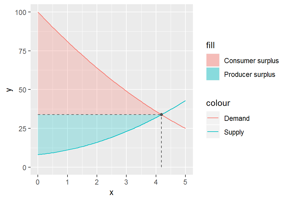
As a last touch-up we drop some chart junk and properly annotate the equilibrium price and quantity.
chart +
  scale_x_continuous(expand = c(0, 0),
                     breaks = q, labels = "q*") +
  scale_y_continuous(expand = c(0, 0),
                     breaks = p, labels = "p*") +
  theme_minimal() +
  theme(panel.grid = element_blank(),
        legend.position = c(1, 1),
        legend.justification = c(1, 1),
        legend.spacing = unit(0, "cm"),
        legend.margin = margin(0, 0, 0, 0, "cm")) +
  labs(x = "Quantity", y = "Price",
       color = NULL, fill = NULL)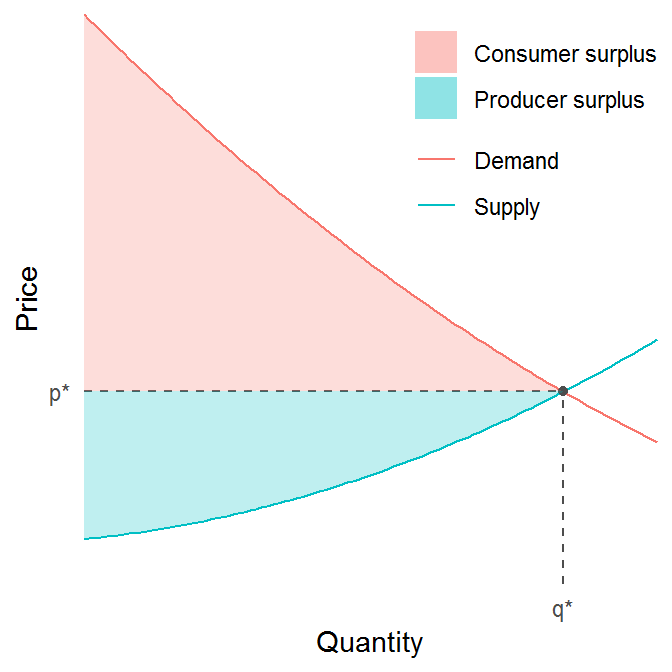
Indeed, we can now wrap all that code in a function that takes as input a supply and a demand function, and returns the corresponding diagram.
plot_surpluses <- function(demand, supply, domain) {

  # Equilibrium quantity
  q <- uniroot(function(x) demand(x) - supply(x), domain)$root

  # Equilibrium price
  p <- supply(q)

  # Domain
  x <- seq(domain[1], domain[2], 0.1)

  # Dummy domain for geom_ribbon
  z <- seq(0, q, 0.01)

  ggplot() +
    stat_function(aes(x, color = "Demand"), fun = demand) +
    stat_function(aes(x, color = "Supply"), fun = supply) +
    geom_ribbon(aes(x = z, ymin = supply(z), ymax = p,
                    fill = "Producer surplus"), alpha = 0.25) +
    geom_ribbon(aes(x = z, ymin = p, ymax = demand(z),
                    fill = "Consumer surplus"), alpha = 0.25) +
    annotate("segment", x = q, xend = q,
             y = 0, yend = p,
             linetype = "dashed", color = "grey30") +
    annotate("segment", x = 0, xend = q,
             y = p, yend = p,
             linetype = "dashed", color = "grey30") +
    annotate("point", x = q, y = p, color = "grey30") +
    scale_x_continuous(expand = c(0, 0),
                       breaks = q, labels = "q*") +
    scale_y_continuous(expand = c(0, 0),
                       breaks = p, labels = "p*") +
    theme_minimal() +
    theme(panel.grid = element_blank(),
          legend.position = c(1, 1),
          legend.justification = c(1, 1),
          legend.spacing = unit(0, "cm"),
          legend.margin = margin(0, 0, 0, 0, "cm")) +
    labs(x = "Quantity", y = "Price",
         color = NULL, fill = NULL)
}

plot_surpluses(demand, supply, domain = c(0, 5))
In case we want the actual numerical values of the surpluses we use the following formulas:
\[ \text{consumer surplus} = \int_{0}^{q^*} D(x) dx - p^*q^* \]
\[ \text{producer surplus} = p^*q^* - \int_{0}^{q^*} S(x) dx. \]
surpluses <- function(demand, supply, domain) {
  q <- uniroot(function(x) demand(x) - supply(x), domain)$root
  p <- supply(q)
  consumer_surplus <- integrate(demand, 0, q)$value - p*q
  producer_surplus <- p*q - integrate(supply, 0, q)$value
  list("consumer" = consumer_surplus,
       "producer" = producer_surplus)
}

surpluses(demand, supply, c(0, 5))
## $consumer
## [1] 126.1227
##
## $producer
## [1] 66.24092For kicks, and to double-check, we can also solve the problem by hand. Setting both equations equal to \(p^*\) gives us
\[ p^* = (q - 10)^2 \]
\[ p^* = q^2 + 2q + 8. \]
Solving this system for \(q\) gives us \(q^* = 46/11 \approx 4.18\). Evaluating the supply (or demand) function at this value gives \(p^* = 4.18^2 + 2 \times 4.18 + 8 \approx 33.85\). Hence, \(p^*q^* \approx 4.18 \times 33.85 \approx 141\). Evaluating the integral in the demand surplus equation gives us
\[ \int_{0}^{q*} D(x) dx = \int_{0}^{4.18} (q - 10)^2 dq = \frac{(q - 10)^3}{3} \bigg\rvert_0^{4.18} = \frac{(4.18 - 10)^3}{3} - \frac{-10^3}{3} \approx 267. \]
and hence
\[ \text{consumer surplus} = \int_{0}^{q^*} D(q) dq - p^*q^* \approx 267 - 141 = 126 \]
which corresponds precisely with the result given by surpluses. Finding the
producer surplus by hand is left to the reader as an exercise.